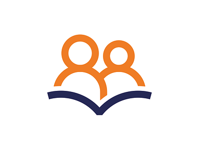
Logo in progress for a literacy charity
I am working on a rebrand for a charity that teaches adults how to read. The brief is:
- Must be simple & highly accessible - nothing too 'clever' or conceptual.
- Should not look childish, cartoony or patronising.
- Needs to show two adults reading together, one is teaching the other.
- Needs to use their existing brand colours.
- Must be clear at very small sizes.
- The book shouldn't be too literal; reading is more than just books!
I would value any feedback, suggestions or advice! Thanks!
More by Alice Ralph View profile
Like


