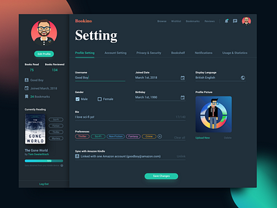
Bookino Setting Page Concept
#DailyUI007 Setting Page.
Most setting pages I saw on Dribbble or Pinterest, look absolutely stunning. However, I ask myself, do they really achieve the high-quality design from usability's point of view? Visually beautiful doesn't always equal to implementation ready or user-friendly.
This is a very basic concept design, using mostly Material Design for the input text-fields.
As for the UX, I thought it would be nice to have an overall self-explanatory page, you control what you see, and everything you see (on the front) is also linked to a certain element in this or another page. There exists no UI component that is just for the sake of being beautiful.
---------------
Cheers!
More by Carlos Han View profile
Like
