Music Player UX Improved
Worked on improving music player experience a little bit. Here are my thoughts:
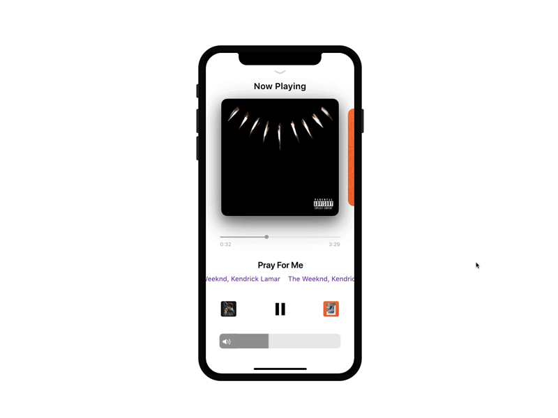
1) Volume bar: if we have good height to drag instead of a slider. This has been already there in control center. People frequently use volume sliders and found it little annoying to tap exactly on the knob or around the knob area.
2) Instead of next song icon at the bottom, Show the next song album cover which helps users to understand what will be next if they tap on it. In future, we can place the title of the song below it.
3) Seek bar has enough space at top and bottom to slide it quickly without worrying miss hit to other elements.