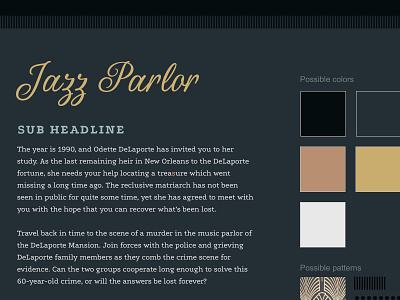
Escape My Room - Style Tile
Style tile for Escape My Room's site redesign, which shows a color palette, typography and button treatment, as well as patterns and other graphic elements. I presented this style tile to Escape My Room to give them a sense of what I was thinking for the look and feel before I invested a lot of time in individual page design. Most of these elements made it all the way to the final designs!
Escape My Room is an escape room company in New Orleans. Founded in July 2014, they opened their first escape room in June 2015. A team of 18 expert artists, producers, actors, writers, and designers help craft each experience.
They approached Clio + Calliope late last year hoping to refresh their brand and website to match the immersive experience of their escape rooms, which incorporate New Orleans history and have a distinctive vintage, mysterious feel.
We refreshed their logo and redesigned their site with tactile, ornate design elements that draw inspiration from 20th century Mardi Gras ball invitations, old storybooks, and vintage advertising.
It's been an amazingly fun project to work on and a nice departure from the clean, minimalist designs that most clients ask for these days.
I always feel lucky to work with clients who expect a lot to be communicated to their customers through design, and bring their own ideas and inspiration to the table.

