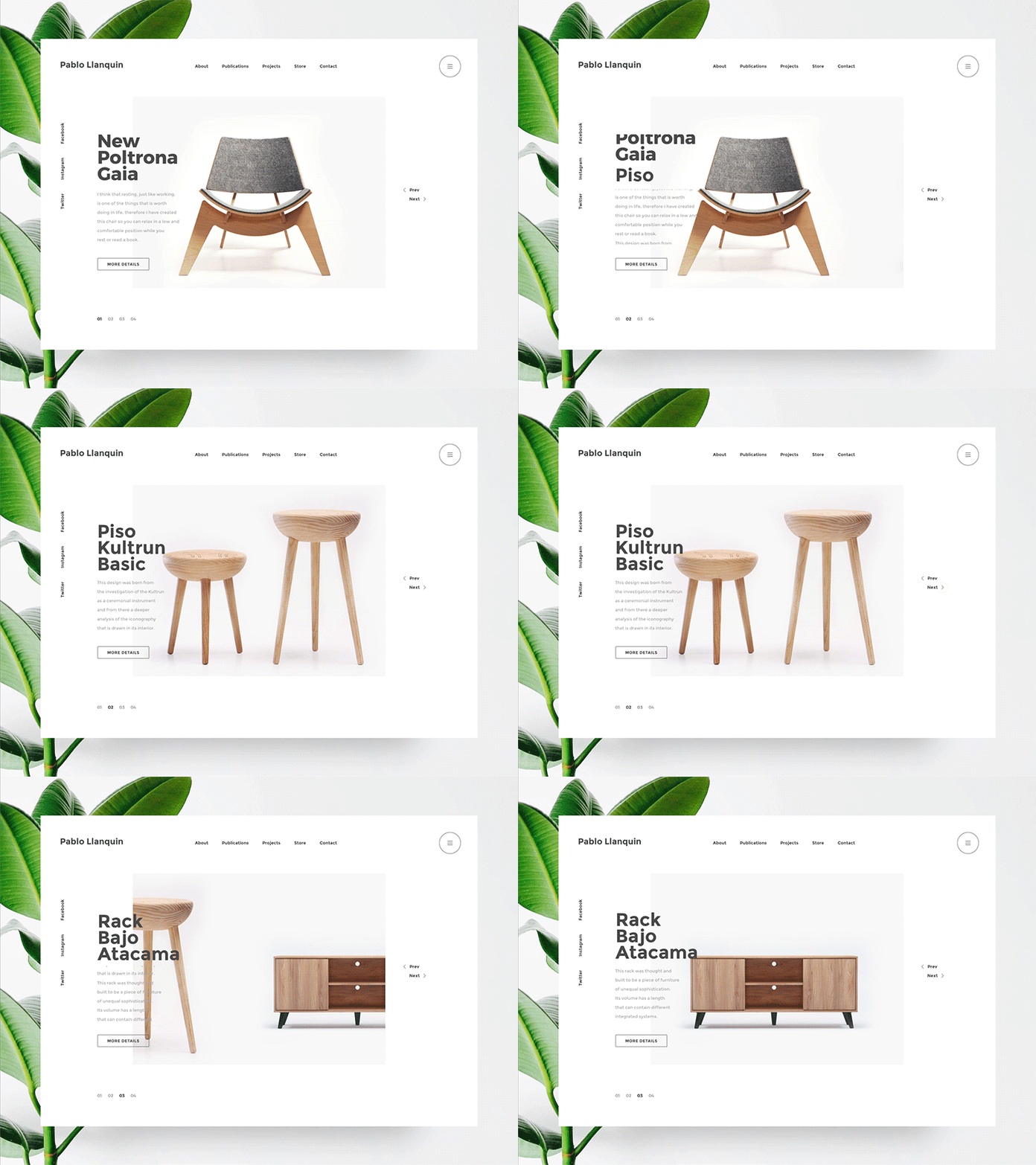
Landing Page
Hello there!
This shot is a concept redesign of Pablo Llabquin’s website. He’s an industrial designer that I deeply admire. I intended to create something simple that would make his products stand up and I intentionally made the transitions to be contextual and slower so they don’t take your attention away.
Hey @Jardson Almeida ⚡️, thanks for your help with some animations. You’re the man!
In the next shot I will be sharing the sketch file as a freebie.
Press "L" to appreciate it
Good vibes ✌🏻
Photo Credit: Behance
Font Family: Montserrat
More by Geovani Almeida View profile
Like


