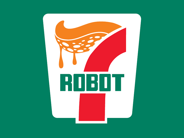
Robot Octopus (7Eleven version)
Continuing with the parody logo project!
Things I learned during this practice:
1: I really really dislike the 7eleven logotype- Well, in that none of their letterforms mapped easily to these letters. I do think it fits its original "ELEVEN" nicely (due to its balanced and angular forms.) However, it was a struggle here due to the curved letter requirements. After working with it, their logotype feels so much like an old terminal font.
2: I honestly expected this exercise to go way faster than it did. That's interesting since technically speaking it's far more simple than the Coca-Cola Exercise.
3: I no longer like the 7eleven logo.
More by Thomas Gatewood View profile
Like
