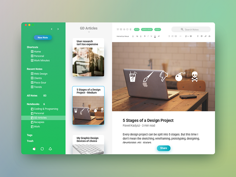
Evernote's redesign
I used to use Evernote a lot back in the day, but then all the changes and limitations became too much for me so I just stopped using it. Not long ago I reinstalled it and noticed that the UI was very similar still to Evernote 5 so I came up with this re-design for fun. I used some subtle gradients and different colors including some from 'Scannable' -another Evernote app. Hope you like it. And if you do, press "L" - Magical things will happen, you'll see! 🤣🤓
More by Pixel Design Studio View profile
Like
