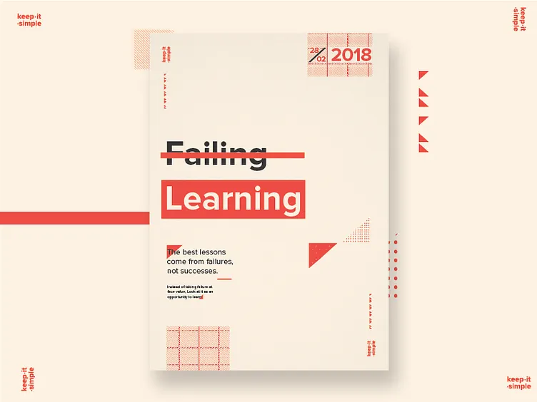
Learning
Another exploration into posters using simple geometric shapes and typography. This time with the help of a grid. Would love your feedback on this design!
Also, The mocked up versions are up on my twitter :) https://twitter.com/FarrelNobel
More by Farrel Nobel View profile
Like
