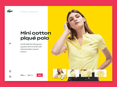
Lacoste Product page
Hey guys,
I was playing a bit with some colours and typography a bit today, and took Lacoste's site as a subject.
Their webshop is quite minimal and white, nothing extraordinary, but there's something about how they advertise their products, and the models they have chosen. It felt like a good match to apply some colours and add some punchiness, rather then keeping it so clean and white.
More will follow, hope you like it!
More by Zsolt Stelkovics View profile
Like
