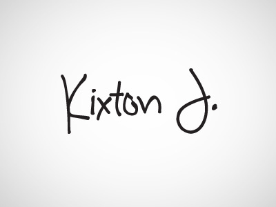
Kixton J.
Logo design for my first son, built into a very simple clean minimalist site to keep overseas family in tune. Note the 'o' has a little notch out of it as my boy has just the smallest little wrinkle on his ear. Simple script based.
More by Kevin Gormal View profile
Like
