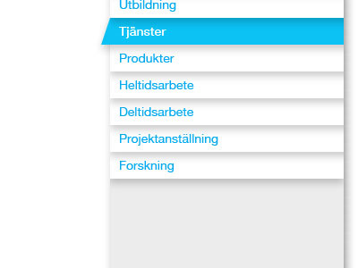
Menu layout
We have this client whose design is very subdued, flat and angular. I wanted a new project for them to have a bit more depth to it, without going overboard with 3D and glossiness. They already use a drop shadow for one part of their design, so I just used it some more. I have no idea if this is going to sit well with them. :)
More by SandmanNet View profile
Like
