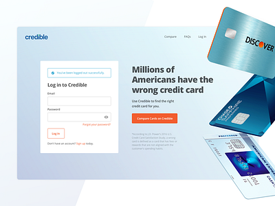
Sign-out page
Last year, we launched our new credit card comparison site. We didn't advertise it on the landing page yet because we were running an A/B test. Instead, we used the sign-out page to introduce the product to our customers.
We framed the messaging around a fun fact to motivate people to check out the site.
See how it turned out: https://www.credible.com/credit-cards
___
Interested in the work we're doing? We're hiring!
More by Credible View profile
Like
