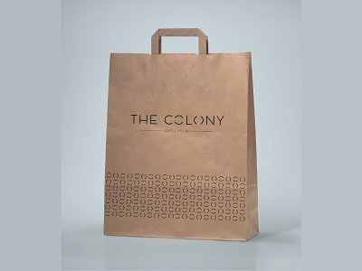
Colony (MINIMAL)
One of my logo designs for The Colony bar in Bengaluru. The restaurant doesn't have a theme in particular hence have experimented with various designs. This one is a Minimal design approach.
Minimal themes are always smart and beautiful. Also, a better approach when the restobar doesn’t want to portray itself as a theme based place. Notice that the two ‘O’s used in the logo are intentionally slit horizontally and vertically, to represent lanes found in a colony. These are
used as patterns across stationery as well.
More by Anubha Upadhya M View profile
Like
