H. product
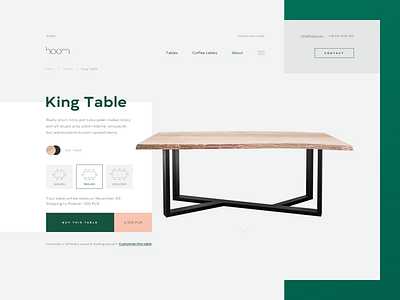
After tweaking some things on the homepage we moved to the most important screens - product page & buying flow.
Today I want to focus on the product page. From my perspective is important to present this kind of product (let's face it - expensive one) in a unique way. Clean layout with some unusual conceptual animation sounds like the right direction for me. Unfortunately, we don't have time to polish animation prepared for developers. Maybe I'll share it someday.
More by tonik View profile
Like


