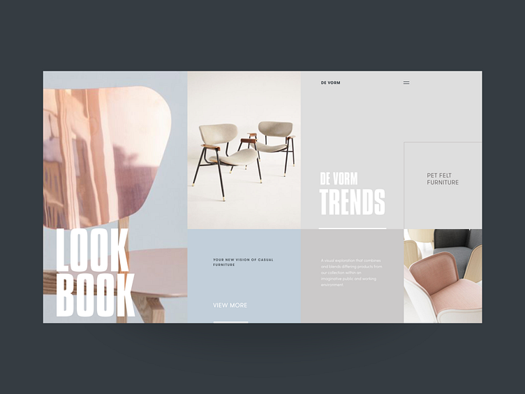
DeVorm Lookbook
Happy Tuesday, friends!
Glad to share with you my new shot. Today, this is a LookBook page for designer interior store called DeForm. Here I was also playing with the broken grid, pastel color tints and product photography.
I think it came out pretty neat, didn’t it? Eager to hear your thoughts and comments :)
Cheers!
P.S. If yesterday you missed my first interview on Muzli about Sochnik design thinking school, working process and motivation - check it out today :)
Press "L" to appreciate it
More by Synchronized View profile
Like
