Taab Marketing Site
Hey!
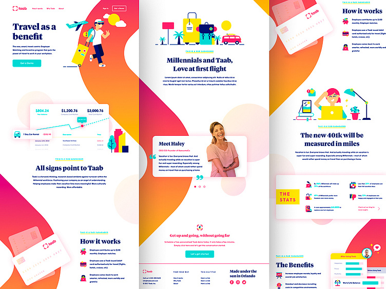
Here's a look into the full marketing site for Taab! I really loved bringing the brand texture throughout the entire page.
More on Brand Texture: Brand texture is consistent artwork that flows from one design to the next. It's the key piece that ties everything together no matter what is, website, business cards, emails, etc. In this case, I used part of the logo and blown it up to create this kind of "road" or "path" throughout the website. It really makes the site! Adding a ton of warmth and it helps to keep the audience engaged all the way down the page.
Context on The Brand: Taab is a new kind of benefit for employees. One that let's you stack up that money for travel! Like a 401k, your employer matches your contribution to your travel fund. Pretty amazing right? Excited to see this go to market.
More coming soon on the full brand build!
Looking to up your company's brand game? 🍄 Let's Talk! 👇 kyle@brasshands.com
