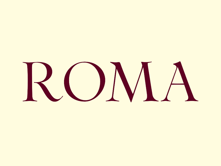
When in Rome…
This week, we are practising with this serif that started out in Sumner Stone’s workshop during the Brazilian ATypi event. The exercise focus on pencil letter drawings with some weight variations. We are showing only the thinner version on this post. In the end, we are looking to get an even dark/light ratio throughout with, calligraphic flair and a hint of luxury.
More by Plau View profile
Like
