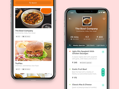
Swiggy Redesign
I recently did an app critique for Swiggy for an interview. Their UX is pretty bad at the moment. I'll probably write an entire post later — but here are a couple of screens that went along with my critique.
More by Siddharth Arun View profile
Like


