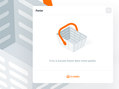
Empty cart, Kitt : Ornikar Design System
We’re making good progress on the new illustration style. We’ll soon be able to push them into production.
We’re following an isometric grid for all of our visuals. Isometry is hot these days, but for us it really made sense to use it, not just from an aesthetic point of view.
Our illustrations are not only intended to package our service and help present it, they’re also here to teach people how to drive. For example, we often need to show real situations, like crossing roads and how the drivers must interact between each other so everybody can drive safely.
More by Ornikar View profile
Like

