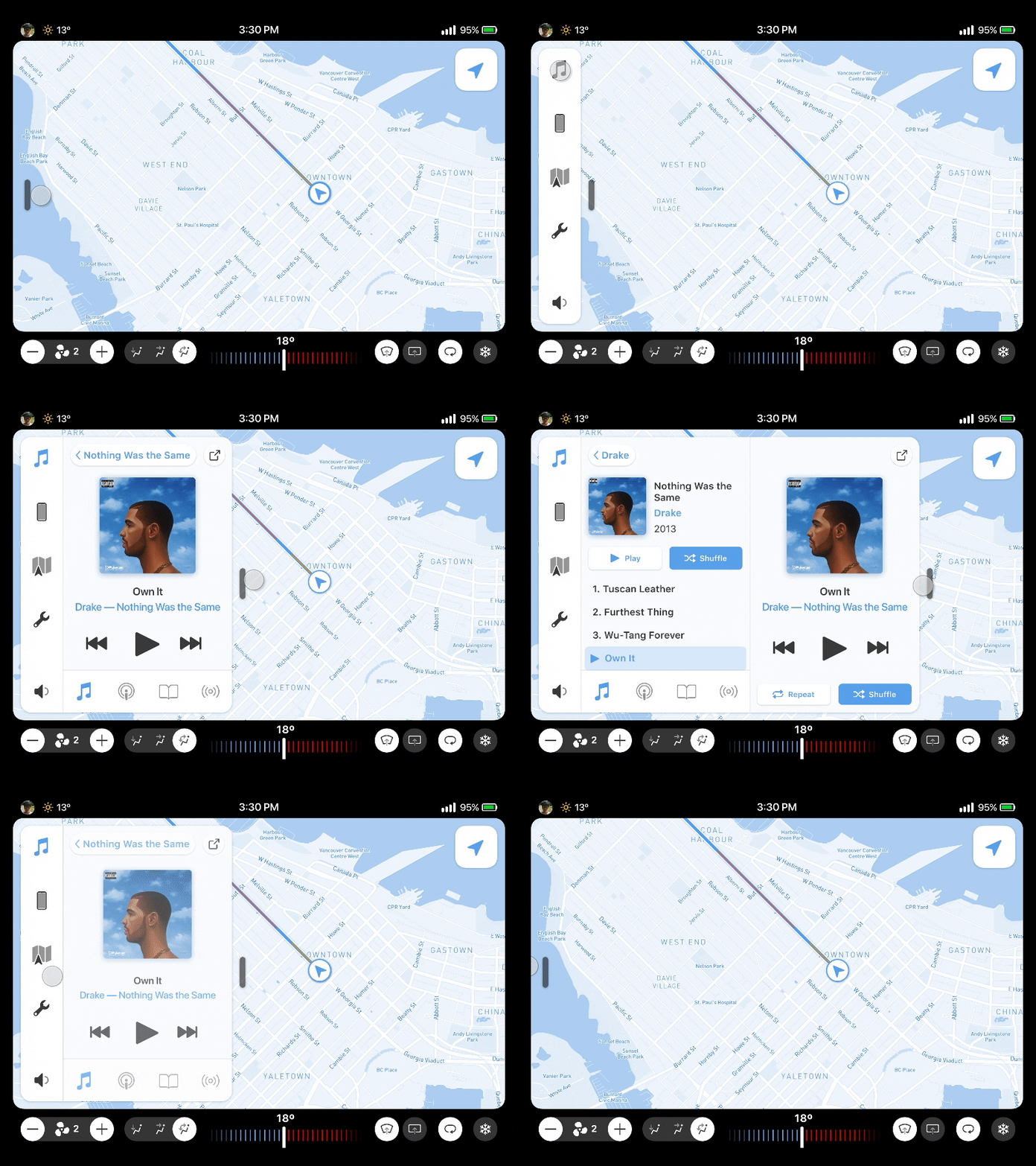
Menu Navigation
Recently I put together a sweet In-Car Touchscreen UI concept for a design exercise.
I generally can't stand touchscreen UIs in cars, physical controls just make way more sense to me, so one of my goals was to make the UI as forgiving as possible and allow for a high level of imprecision. This meant most of primary navigation took the form of sloppy swiping.
This is an example of the navigation for the main menu and the Now Playing and fully expanded music views.
A mix of various climate controls, including steppers, sliders, toggles and dials bring some tactility to the UI.
👉 Check the attachment for a high res screen of the expanded player UI.
More by Jordan Borth View profile
Like


