Detroit Institute of the Arts
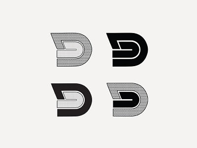
The rebrand of the Detroit Institute of the Art museum played off the motif to reflect the museum’s culture within the heart of Detroit, and the work that is displayed. With further research, DIA exhibits work within the 1960’s to 1970’s, which led to creating the new logo to follow within the same retro era.
Complete with a pastel color scheme, bold text, and lines, the logo was able to give off a sense of this aesthetic. As museums are ever changing, just like art, we wanted the logo to be able to be mixed with contemporary design to give DIA a new look. By using various patterns within the logo, it is able to play a versatile role within the branding applications completely.
More by Annie Hall View profile
Like
