KARE -Instant baby-sitter finder
Hey!
This is my first dribbble shot, let time decide my design skills!
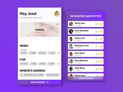
This is an experiment: Easy to chose predefined data boxes, I believe are more welcoming and easy to interact than typing or choosing from a time picker.
It is for an babysitter finder app, The user has the already uploaded the details about her baby, whenever in need of a babysitter, simply answers three easy, sense making questions, "WHEN" -She needs a babysitter, "FOR" -how much time, "WHERE" -Where the baby is currently. "SEND REQUEST" -It is the cta, calling the user to take action & is the highest level in hierarchy table.
I also focused on the appropriate use of words, I believe voice and tone are very important factors that determine the brand of the app and also help in establishing the relationship with the user.
----- LINKS -----
YOUTUBE: https://www.youtube.com/channel/UCqG4XOzPx-Hget_KOJU97pw?view_as=subscriber
TWITTER: https://twitter.com/Prince_73ssan
