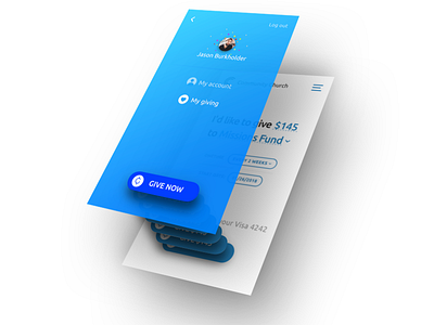
Menu overlay the ability to give
Thinking beyond the user Interface…
We’re always trying to think about the broader experience throughout Give.Church, all the way down to the details.
You'll notice the placement of the Giving Button matches identically the placement on the giving page. Additionally the placement of this "primary" action is within comfortable reach of thumbs everywhere 👍🏽. On smaller screens, there is a seamless transition between the menu and the ability to give.
Tell me what you think!
More by KINDRID View profile
Like

