Chair Page Transition
'Sup guys
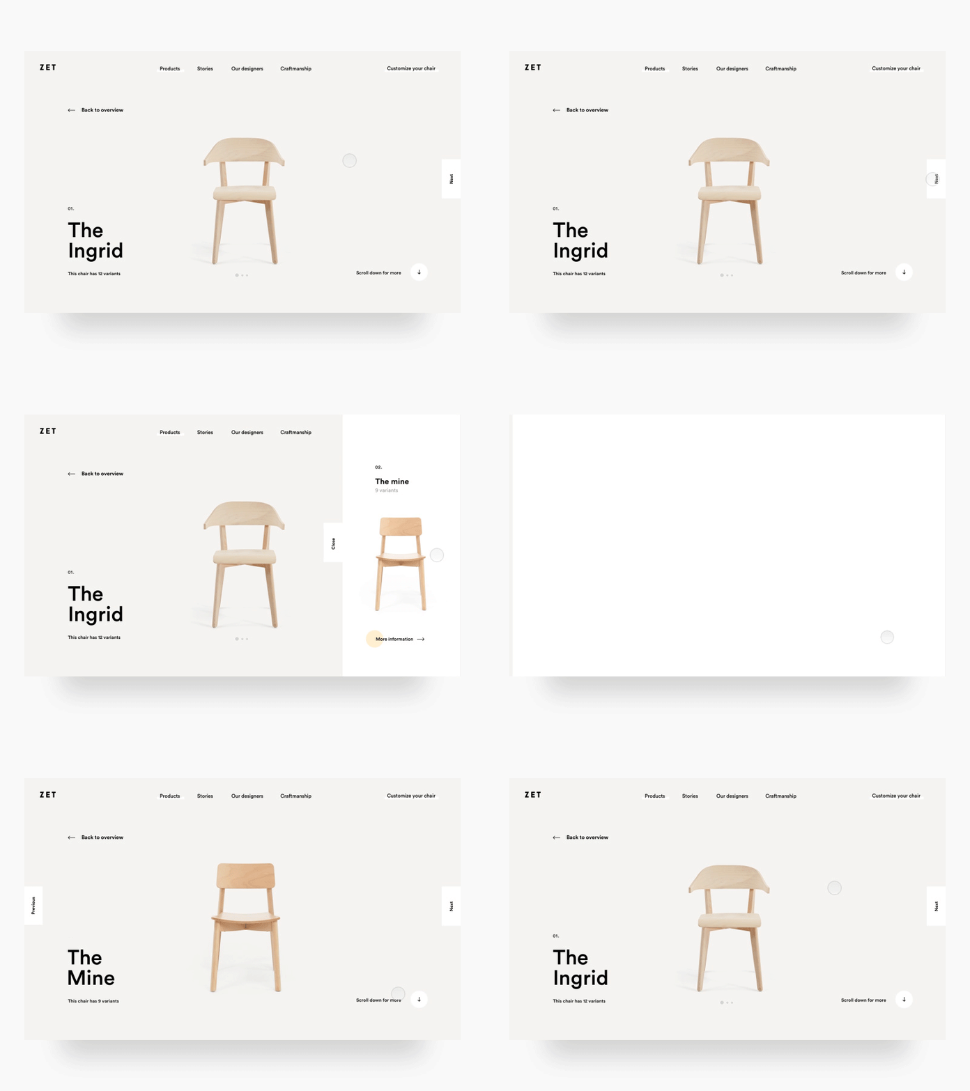
Been working some more on the ZET project at the studio. Here's a view of the above the fold part of a chair detail page. Each chair has several variations, that's why there's a detailpage for each chair.
On the right you'll see a next button, when the user clicks (or hovers, not sure yet) this, a preview comes from the side with some info of the next chair. When that's clicked the user will go to the next chair page.
Let me know what you guys think!
Have a great week guys! Peace
—————————————————
Want to learn design and animation like this?
Check out my classes on Skillshare.
Use the links below and get 2 months Skillshare premium for free!
Visual hierarchy and spacing: http://skl.sh/2h4JrWa
Timing and easing in Principle: http://skl.sh/2D8StYQ
Big thanks to everyone for the massive support on the classes! You guys are the best!


