Lookbook Page Design Animation for Roller Skates Project
Hello Dribbblers!
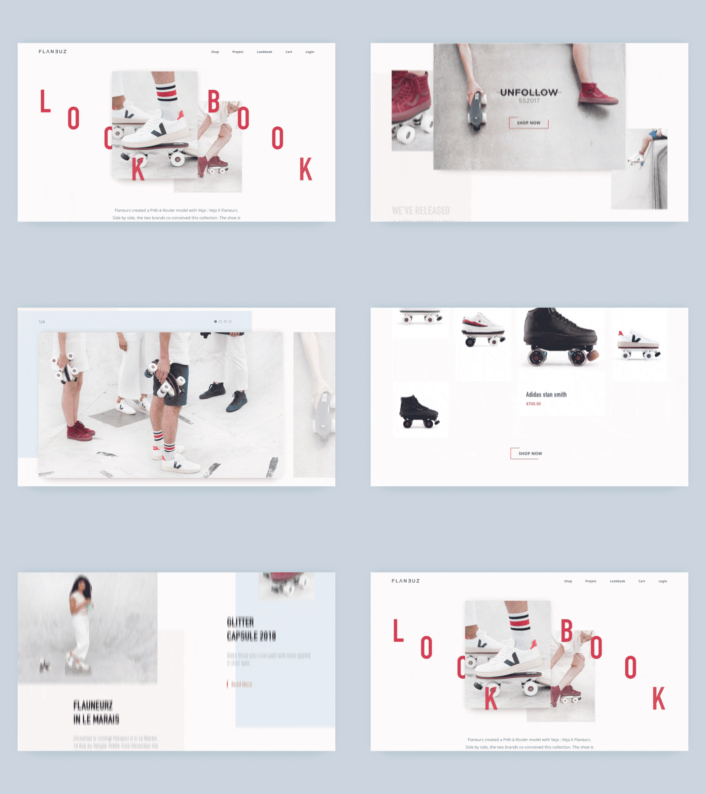
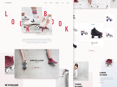
Here's the lookbook page we designed and animated for a roller skates website we’re experimenting on here at Zajno.
Goals Rethinking the way content is displayed on the page to make it more appealing to the target audience to help the guys get more foot traffic and popularize their cool product.
Approach After studying the target audience and creating use cases, it was clear that the main task is to make the website look trendy and catchy enough to appeal to the youth ‘cause the product is mainly targeted at this group. To this end, we chose to use pastel color palette and broken grid to add a little twist to the overall style. The only elements we used more intensive colors on are the CTAs for pretty obvious reasons I guess. Big, appealing visuals are an integral part of a look page, so we used quite a lot of them trying to arrange them in the most efficient and nice-looking way.
Results We ended up with a clean and visually rich lookbook page that can get more foot traffic and attract more customers and, of course, more revenue as a result. Since it was exactly what we were tasked with, we’re happy we’ve reached the objective. Would love to hear what you guys think of this!
Don’t forget to follow Zajno on social media and feel free to drop us a line: Website | TheGrid | Twitter | Instagram | Medium

