Bremer — A Brand Identity
Read about the story and the concept of this branding in the previous posts.
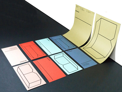
The design of the "Bremer" identity is very minimalist. That is because we picked a strong variety of color for the production. The colors represent the joyful character of the company, and their competence diversity. We produced this branding on paper series "Crush" which has an amazing rough structure with actual crushed kennels such as nuts, olives, kiwi and more. This brand identity is a real haptic experience.
If you like our work, please follow us on Facebook and Instagram:
www.facebook.com/kr8bureau
www.instagram.com/kr8bureauvienna/
