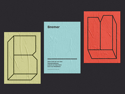
Bremer — A Brand Identity
Read the story of the "Bremer" branding in the previous post. About our concept: Instead of kicking off with a logo we decided to go with a clean type concept that represents a strong base of their elaborate values. The letter "B" always stretches to fill out the canvas, which is symbolically how "Bremer" wants to see their service: Fulfilling client's needs.
The quote on the bottom of the poster says: "We might only be a property management company but Clark Kent is just a journalist, too."
If you like our work, please follow us on Facebook and Instagram:
www.facebook.com/kr8bureau
www.instagram.com/kr8bureauvienna/
More by KR8 bureau View profile
Like
