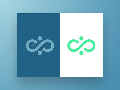
Contemporary Cavewoman Logo Construction
This is a quick shot at the logo I recently put together for a nutrition coach. The goal was to incorporate the two c's from the company name while communicating the core value of balance. Driving towards something that could be seen as a hieroglyph but made more 'contemporary' led me to look at symbols like infinity and yin yang. I did my best to combine the two while using the golden ratio (1.618) for the circles and proportions. That really helped everything feel balanced and created a firm relationship between the elements.
All in all it's a fairly simple mark but Im happy with the result and looking forward to getting some type partnered with this and filling out the rest of the brand.
More by Andrew Gauer View profile
Like

