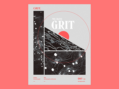
057 Site Classy
Site Classy: Day 057 of Project Decade.
One of the first attempts at putting an illustrative spin on a UI design. The reference was a site design we worked on back in 2008 for Aharmon Design Group. High contrast, natural textures and ample white space.
Project Decade is a year long, daily design challenge. We’re taking an image we created in the last 10 years and remixing or reinterpreting it every day throughout 2018. That means 365 fresh spins on our classics. Our only two constraints are: produce a new image inspired by the past and complete the work in an hour or less.
P.S. You’re invited to put your own spin on any of these works. Download the attachment and rebound the shot. Our favorite each month will receive a freebie (think: Amazon gift card, Dribbble pro subscription, etc).
Follow us on:


