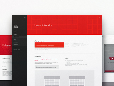
Kelloggs Experience Guidelines
We created a set of UX & UI Guidelines for Kelloggs and their numerous agencies on record around the world to maintain quality and consistency for their websites.
For example, when Kellogg's hires an agency to design the Pringles website, they will follow these guidelines to make sure they're using best practices, they produce quality work, and they build a site that feels cohesive among the other Kellogg's brands by using a similar grid, type scale, icon creation framework, etc.
More by Cameron Sagey View profile
Like
