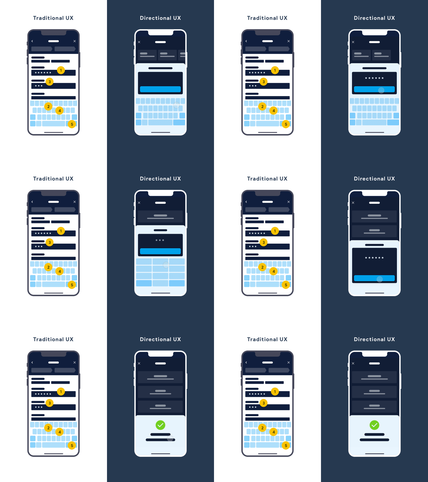
Traditional vs Directional Form Filling
The direction on which to use should be base on the number of steps intended to complete the task (assuming all fields are required*). If it takes less then 5 steps, then why not focus?
Traditional UX: - Bringing familiarity of physical form filling to digital. - The deficient digital adaptation is amplified on small screens where the keyboard blocks the visual of other fields.
Directional UX: - Anchoring on Hick's Law, user needs are further studied and understood. - Unnecessary options are filtered and users are directed to complete the intended task with minimal steps. - Reducing an additional click to bring up the keyboard.
More by Samantha Tan View profile
Like
