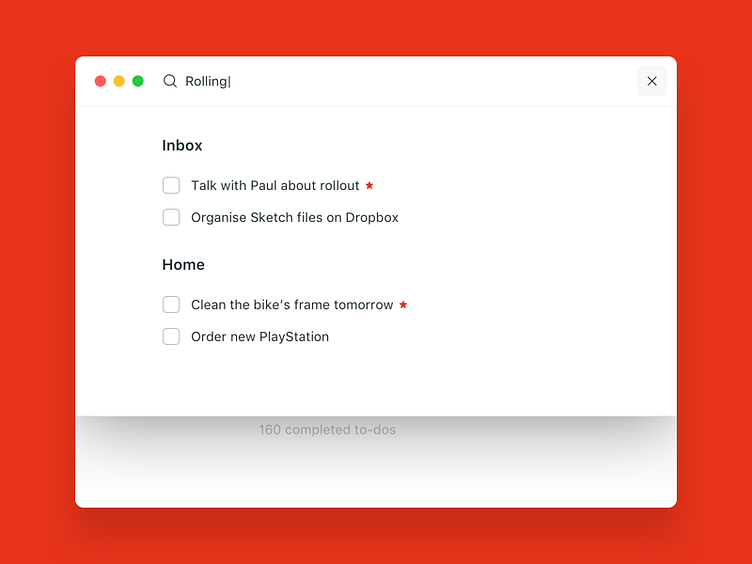
Wunderlist redesign - search screen
Hey guys,
I use Wunderlist every day and I love it. However the design is more or less the same for years now, and I thought it would be interesting to look at it from a more clean, minimal point of view.
I was trying to keep the functionality the same, as many of us - Wunderlist users - are used to it.
Hope you like it!
More by Zsolt Stelkovics View profile
Like
