Footer
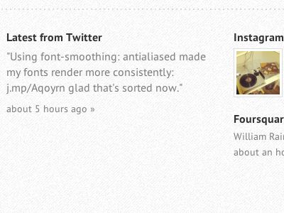
Currently working on the footer for my new Tumblr theme, which will include heaps of third party widgets.
I usually like to keep my footers pretty "out of the way" as not to distract from the main content. In this example all links and text colours are the same which may come across as a bit bland or too static, do you think I should apply a link colour or not?
Was also thinking of a Joey Pfeifer approach where as soon as the user scrolls over the footer, all the links light up (see his header on his website): http://joeypfeifer.com/
edit: see attachment for more context.
More by William Rainbird View profile
Like

