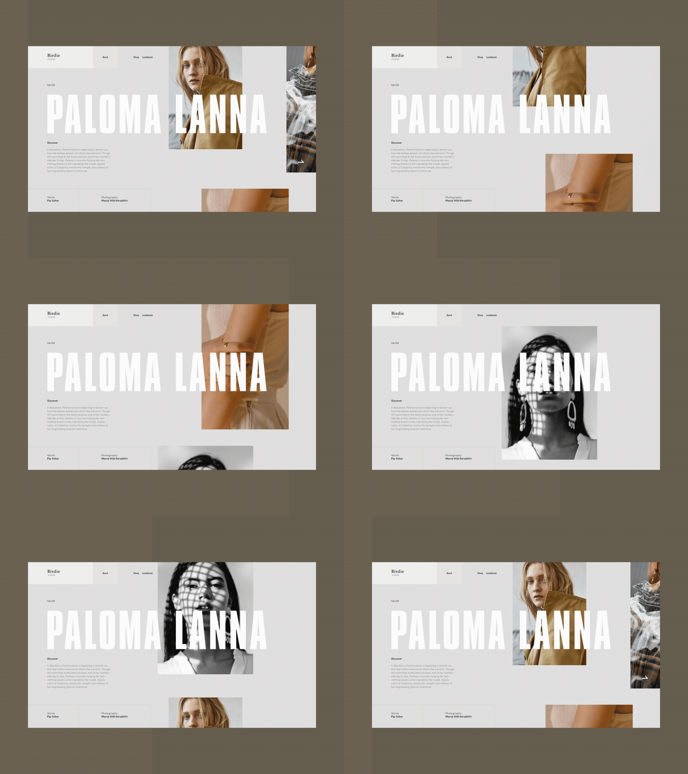
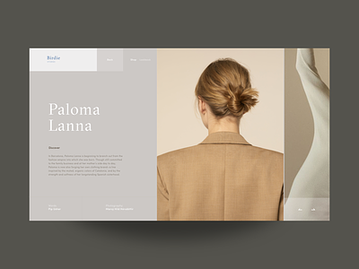
Birdie Fashion Store Blog Inner Page Animation
Guys,
Glad to share with you the alternative version of the article page designed for the fashion e-commerce Birdie project.
My general objective with the design was to play with the geometry of layout, broken grid and whitespace. The transitions are to support the overall minimalistic concept.
Eager to hear your feedback!
Enjoy your weekend :)
Cheers!
Press "L" to appreciate it
More by Synchronized View profile
Like

