Experimenting with Snapchat UI on iPhone X using Adobe XD
I was just playing around with some Snapchat UI improvements to the app for fun that i personally think it would benefit from, whilst learning more about Adobe XD a few weeks back. Just getting around to putting it on here!
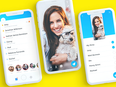
Tried to combine the ‘add friends’ with the ‘search’ feature to de-clutter the top bar
Added in ‘Stories' as a separate module to the snapchat feed, also placed these to the bottom of the screen which are easier to reach than elements to the top especially on iPhone X and larger devices.
Changed the layout slightly on the camera trying to group all UI features together rather than have them randomly spread across the page.
Sending a snap allows you to playback your snapchat and see it before you send it using the top half of the app screen as a preview whilst selecting friends below.
I’d love to hear your thoughts?
