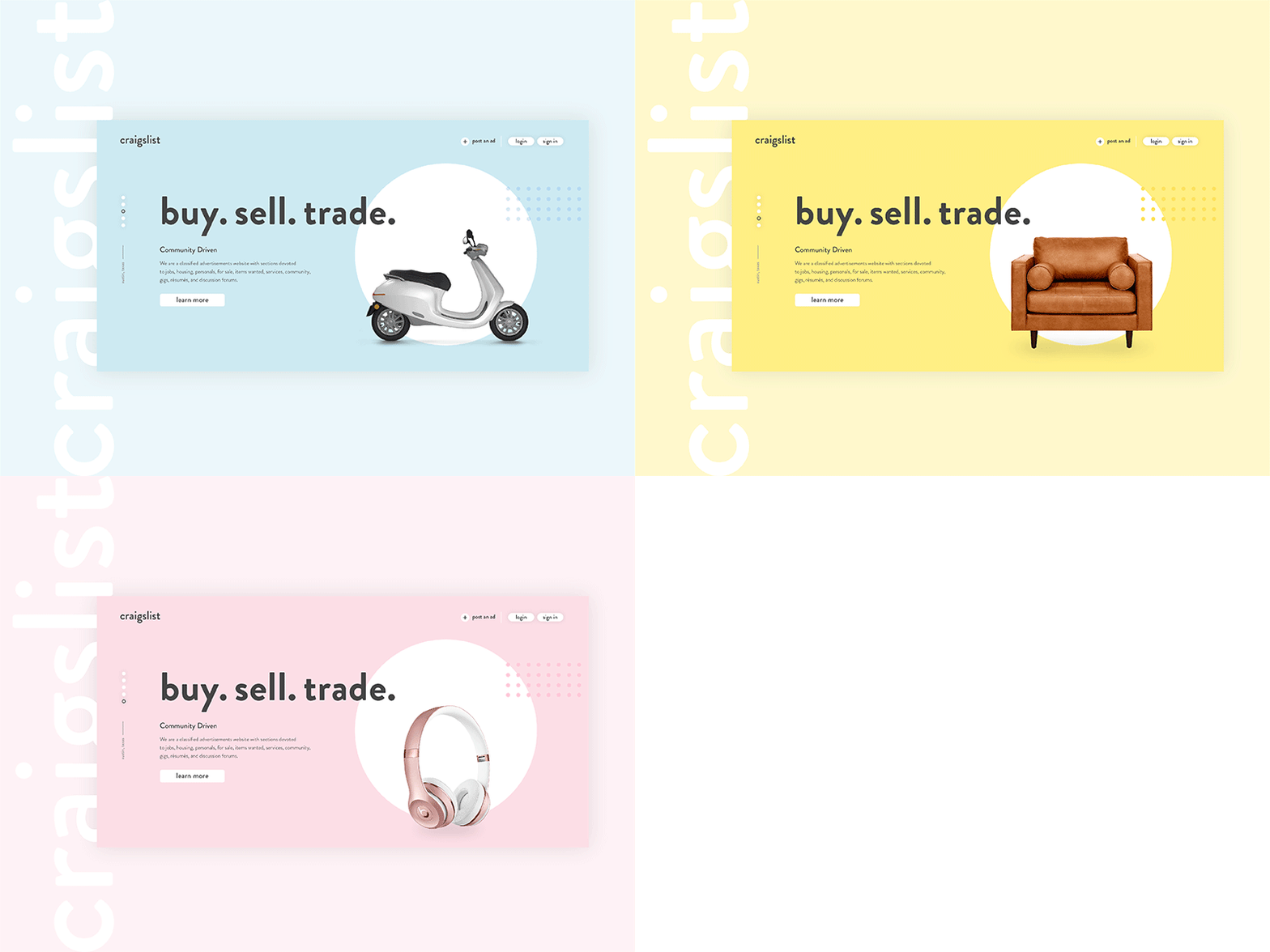
Craigslist Redesign — Concept
I've redesigned Craigslist's website to be more approachable, interactive, and skimmable. While doing research it was obvious the most common user complaint was lack of transparency, so a rating feature was added. Buyers and traders have the opportunity to filter out sellers who have no customer ratings or pictures to give them peace of mind during their buyer journey. After making the website more visual, adding hierarchy, and including customizable filters; the currently disorienting Craigslist interface becomes an inviting modern experience. Hope you guys like it!
Like


