Craigslist Challenge - Minimal Redesign

Minimal redesign of the Craigslist website.
Part of the Uplabs challenge: Craigslist Challenge.
First of all, craigslist website is awesome and simple, based on my experience I redesigned it this way.
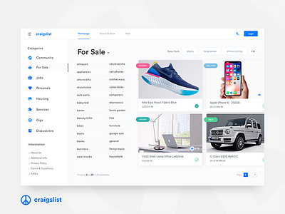
No need for everything on the homepage, why?
-Well because when I visit craigslist I am interested in only one category and its subcategories.Based on this redesign I have the option to click on a category, if interested to expand that category.
-The concept might look a bit different but it is just structured in a different way, in a more modern way in my opinion.
-All the categories can be found on the left.
-The subcategories show right after you select a category followed by the latest posts.
Hope you guys like it. :)
