Payment Settings
Payment information is boring. I wanted to change that.
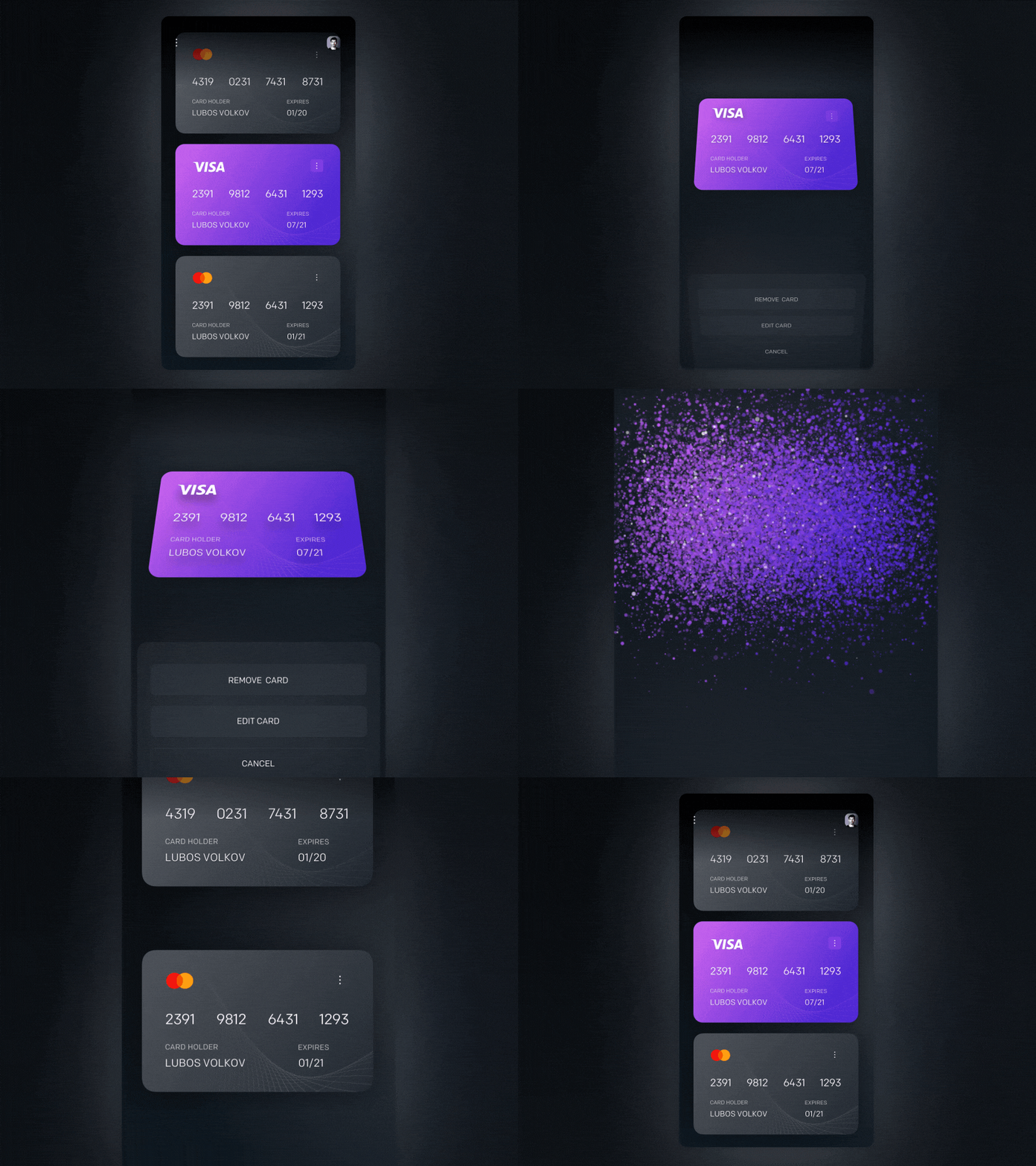
Over last few days, I have been iterating on this interface where users can store multiple credit cards.
One of the challenges was to come up with the creative way of removing and editing the card(s). I have decided to use (X) rotation for the card to achieve this 3D looking effect (inspired by Sketch).
For removing of the card I literally wanted to destroy the card. I am happy with the results. What do you think?
________
📸 Behind the Scenes & My process – Instagram
More by Luboš Volkov View profile
Like


