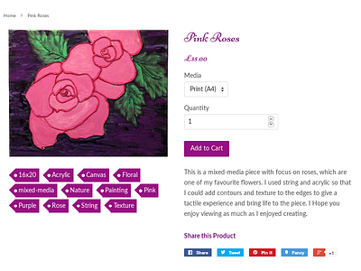
Pink Roses Shot Thumb
So after someone criticised the last iteration https://dribbble.com/Caterinaghost (a bit vague, no examples but maybe you had a point), I iterated again on the design. This time bringing semantic-ui style tags. I'm still not sure it's "done". Specific area's I think I could work on are the padding, the margins between elements. The colours have changed from "rebeccapurple" because it was an isolated colour; perhaps a slight text-shadow would enhance the look.
What I don't seem to be able to get rid of, even with pixel-sizing is the slight underflows and overflows of the ::before pseudo elements. After is just-fine, but the before element is being a dick. I've tried a number of different size-units, it's not the most important thing, but it is a little annoying.
Any comments on fixing that underflow / overflow (which I think is a browser-engine rounding bug), please include a link, I'm always open to learn something new.

