About Page
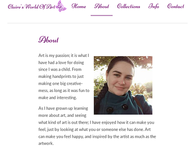


So initially the page was a wall of text, which kinda sucked. There wasn't much to do in-terms of awards or accreditations, professional memberships, so I focused on making use of some simple floats, a blockquote to add visual differentiation.
I did look at moving elements off both sides of the rail for larger screen sizes, but in the end I came to an agreement with the artist that it had more of an effect just taking the image off the rail.