Which One?

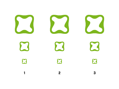
Which one do you prefer? The intention is to have a 'Z' shape in the logo, but it's a thin line between making it too obvious and too 'X'-like.
Which one do you prefer? The intention is to have a 'Z' shape in the logo, but it's a thin line between making it too obvious and too 'X'-like.