Birdie Fashion Store Blog Page Animation
Hey,
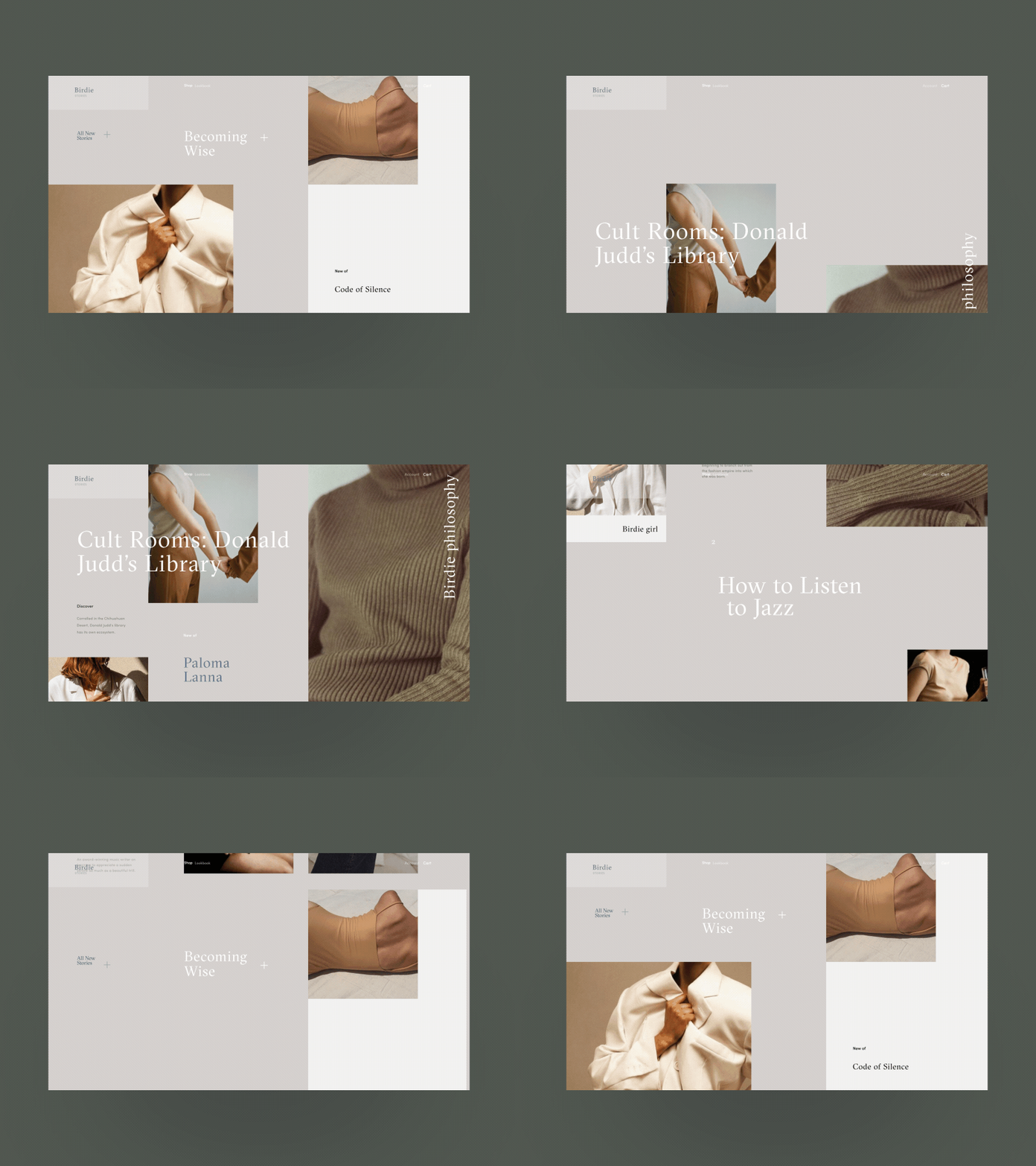
Glad to share with you the animated version of the blog page for the fashion e-commerce Birdie project.
My general objective with the design was to play with the geometry of layout, broken grid and whitespace. The transitions are to support this UI direction even further.
Eager to hear your thoughts and comments!
Cheers :)
Press "L" to appreciate it
More by Synchronized View profile
Like

