THIRTY LOGOS: The Grind
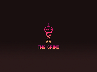
"Small coffee shop branch located in Seattle, WA the brief wanted a logo that stands out compared to other coffee shops and that they could use on signs,menus and coffee cups of course.
The idea behind the logo was to use the space needle as its a key part of seattle and implement it into the design using a coffee bean. The colours are bright to be eye catching and match the city lights. Not a huge fan of the font ive used but the logo took alot longer than it should have.