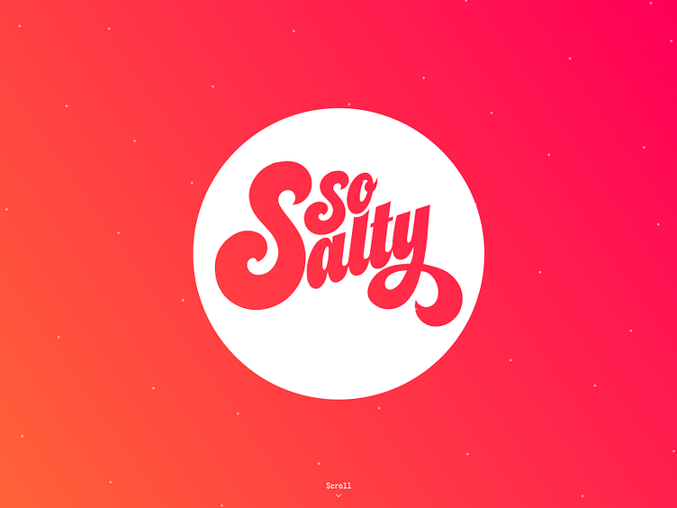
So Salty
Spent some time revisiting the 'So Salty' Logo. Not too much of a change from the original typeface but I amended the 'y' to try and balance out the 's' a bit more.
Naturally I could spend a lot more time perfecting the typeface but i'm trying to get into the habit of just making stuff at the moment, I know it's meant to be quality over quantity but sometimes I get so stuck with making something perfect I end up making nothing at all...
Any other designers suffer from this? Would love to know how you guys deal with it.
More by Liz Hamburger View profile
Like
