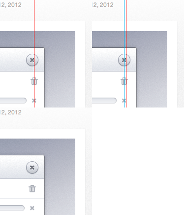
Alignment Adjustment
So I hate to do this type of stuff sometimes, since I really do like this. But 2 things about this were bothering me (contrary to the "cancel" button dilemma, I actually don't mind it).
I think you should align all the buttons. It is just strange otherwise and really disrupts flow.
In terms of UX, I think the 'X' button (top right) should be MUCH smaller. It is too inviting :) It is very pretty but, its too big and confuses the issue of playback like some users might have mentioned.
Anyways I think this is really pretty and is very cool. While I understand you did it for fun, just thought I would drop a few cents. The load bar is really fantastic.
More by Mike Puglielli View profile
Like
