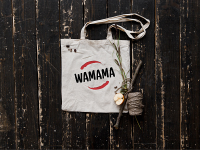
Wamama
Hi! First shot here :)
Worked on branding project for a Pan Asian Restaurant that'll be opening in Bengaluru soon. One of the three logos I've designed for this restaurant. I call this route "Koi Chillis".
Koi fish, was brought by Chinese invaders to Japan, where the fish flourished. They are often paired with the Yin-Yang symbol, representing the harmony of two opposite energies coming together as one, creating a perfect balance. In this logo, Koi is replaced with red hot chillies and the logotype is strikingly bold and Asian.
The branding and stationery consistently has a grunge look with lots of Asian references.
More by Anubha Upadhya M View profile
Like
