Sartra Tooling—01
The initial concept for a new groundcare tooling company. The aim with the logo was to make prospective trade buyers wonder how they had not noticed the Sartra brand before rather than feeling like it is brand new.
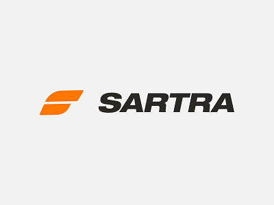
The icon is created from 2 simple shapes to create an abstract "s" in the shape of a leaf. The 2 shapes reflects the brands beginnings in tooling, portraying a chop from garden shears.
Press "L" to appreciate it.
Feedback is always appreciated so let me know your thoughts!
—
A project undertaken at FINALLY.