Liquid 360 Revision
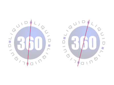
Looks good. I like the concept, but there are some nitty gritty alignment issues I think you could work on. I love the offset of the "Liquid" type, but I think the way it is now a lot of people may think it's a mistake, versus a design decision. If you offset by a few more degrees I think that would help a lot. Also make sure to take a look at the kerning versus the white space of the square separators as well as the size of the squares versus the line-height of the type. Great start to this though!