M Exploration
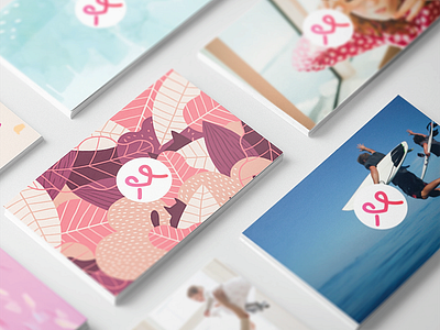
A logo concept that came out of last year's rebranding effort. This one had a lot of concepts and requirements baked in: caring, connection, sincere, M shape, flexible, works well small, works well as signage.
Ultimately this just had the wrong vibe. Too tech, not expressive enough. But I'm still very happy with how it came out.
More by Max Shuster View profile
Like
