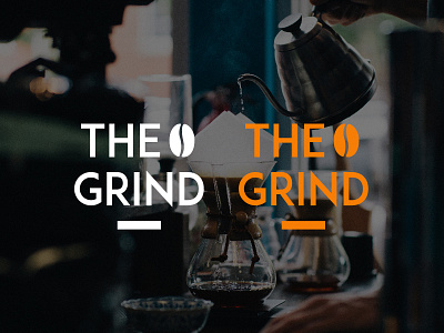
THE GRIND | Thirty Logos | Logo Challenge #2
"The Grind prides itself on natural and local ingredients. For our new logo, we actually do not want to use any browns! So many coffee shops around here use brown and we'd like to stand out. Maybe oranges, green, other earth tones, etc. could work well.
The Grind logo could be text based or have an icon, we're open to either/both. We're open to using symbols that represent coffee such as the coffee bean, plant, grounds, coffee cup, etc.!"
More by Inês Lucas View profile
Like
